Blast From the Past Series: IKEA Menu
BY: JOSHUA GANDEE
Beverage Director, Watershed Kitchen & Bar
The first time I presented the IKEA menu to bar guests on the day of its launch, it was to a couple who seemed slightly upset and in need of a drink. I laid the menu in front of them, and they quickly pushed it back and said, “We just left there!” exasperated. It was from that look of fear, frustration, and stress in their eyes that I knew we had nailed it with this menu. This list of Scandinavian-inspired, clean-lined cocktails evoked a special kind of panic in this couple who had just left the showroom, and I couldn’t have imagined a better test of its abilities.
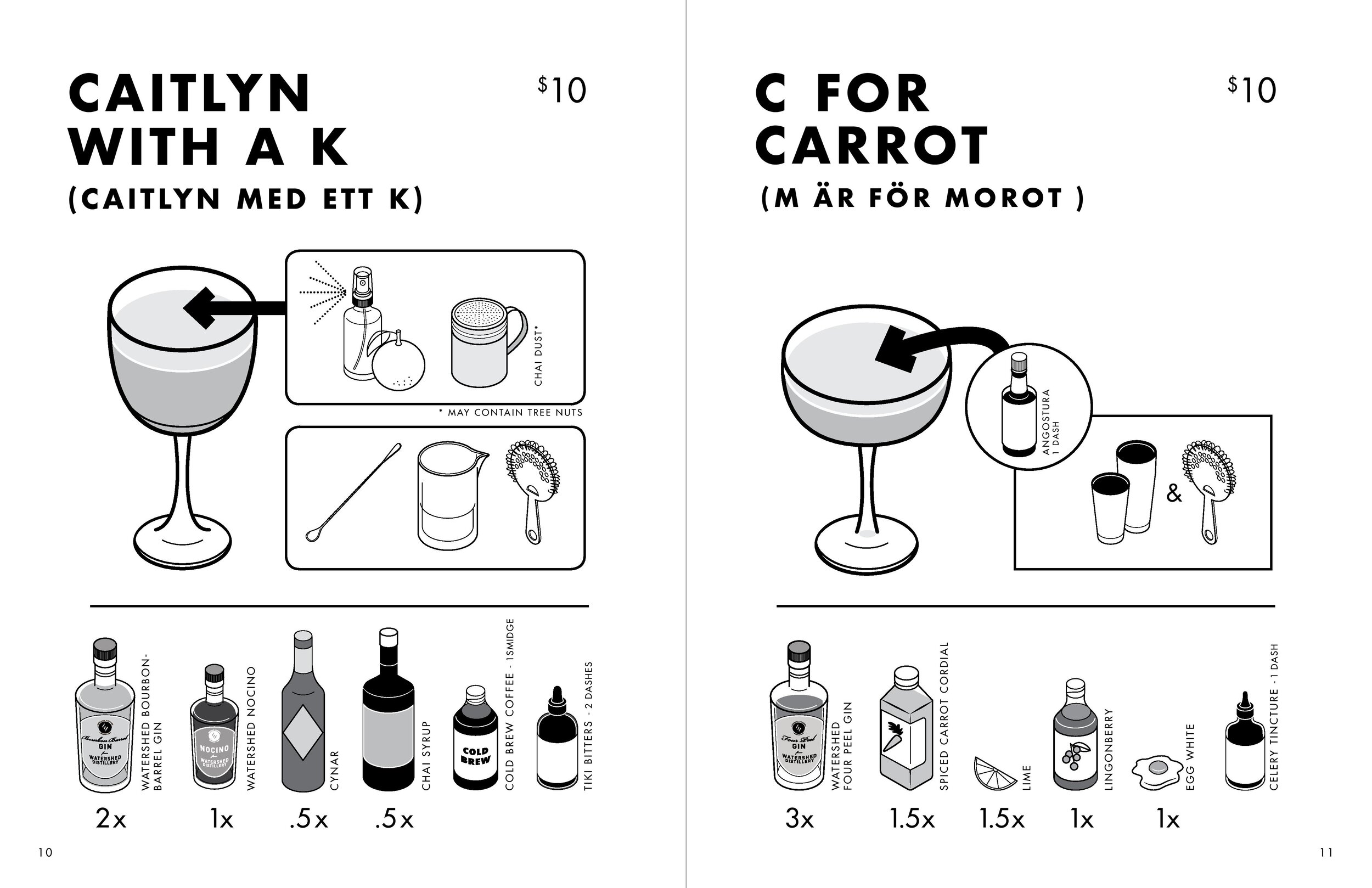
As lead bartender at the time, I worked hand-in-hand with Bar Manager Alex Chien to fine tune an IKEA menu inspired by the furnishings retailer and the minimalistic design. We weren’t asking our guests to fashion a couch from a box with only a hex wrench, but we needed them to understand the mindset we were in. The drinks that were served alongside the design of this menu had to live in that world. We couldn’t have a cocktail with a Swedish name, show all the parts to the drink, then have some ornate tiki-style drink hit the table. A bouquet of edible flowers, something on fire, and swizzle sticks would take command of the table, and lose the allure of the black and white menu.
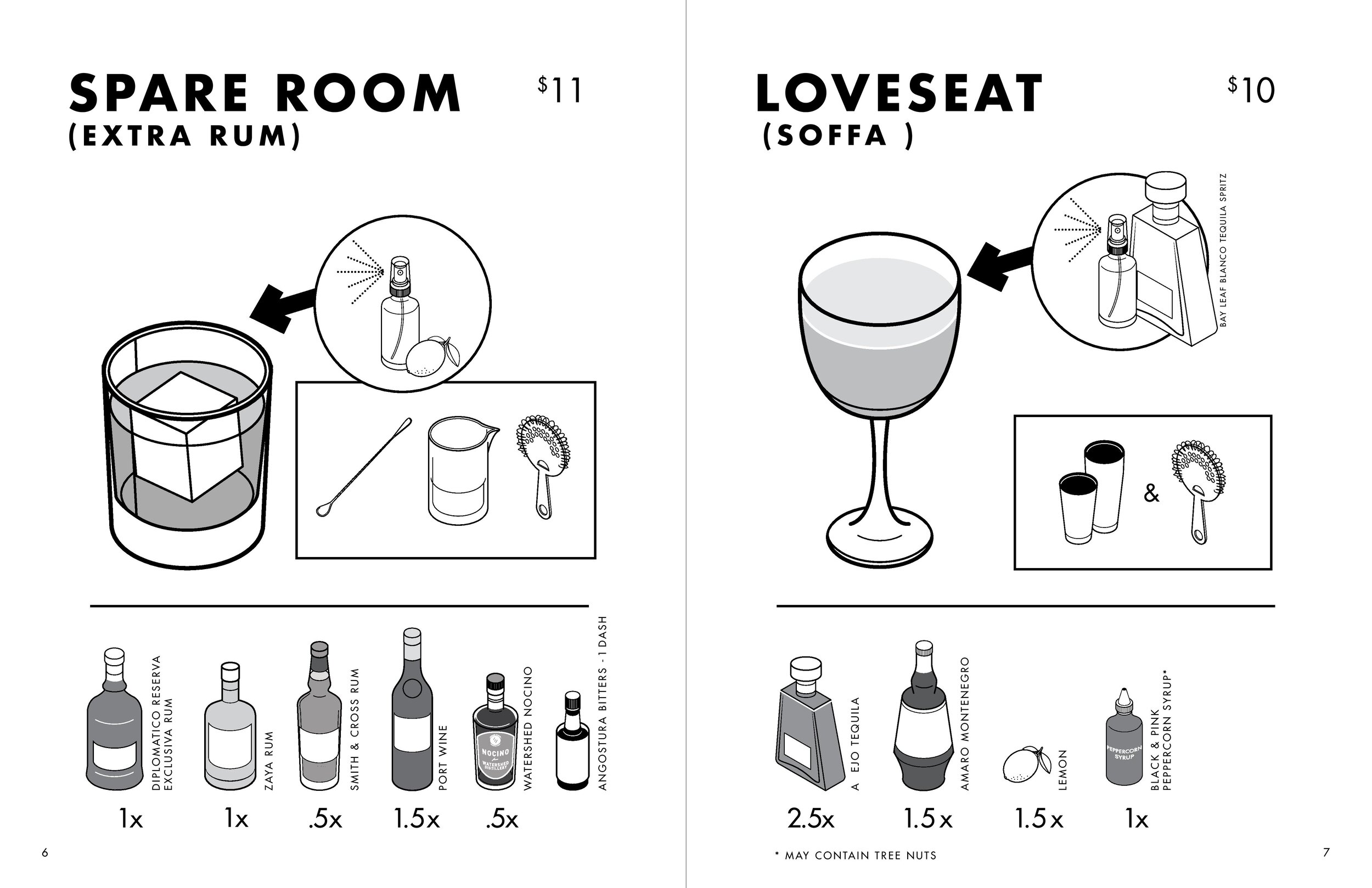
Spare Room
The IKEA menu was also a jump for us as a bar program because we were giving away the farm, so to speak. With each cocktail listing, we shared the whole recipe. Typically, recipes from menus are shared in friends groups or through publication, but it is rare that on the day of the launch every ingredient and its measurements are shared for all to see and possibly replicate. The drinks were not simplified in any way for those looking to recreate them at home just as that triple rack rail from IKEA will test any relationship, and may require one member of the assembling party to sleep on the half assembled couch for the night.
We presented the idea for the IKEA menu to graphic designer Greg Davis to understand what details we could include to truly sell the theme. The eventual menu cover had a clean line drawing of our bar that even included our favorite painting of an old hound dog. Greg even reconfigured the Watershed Kitchen & Bar logo to resemble the IKEA format.
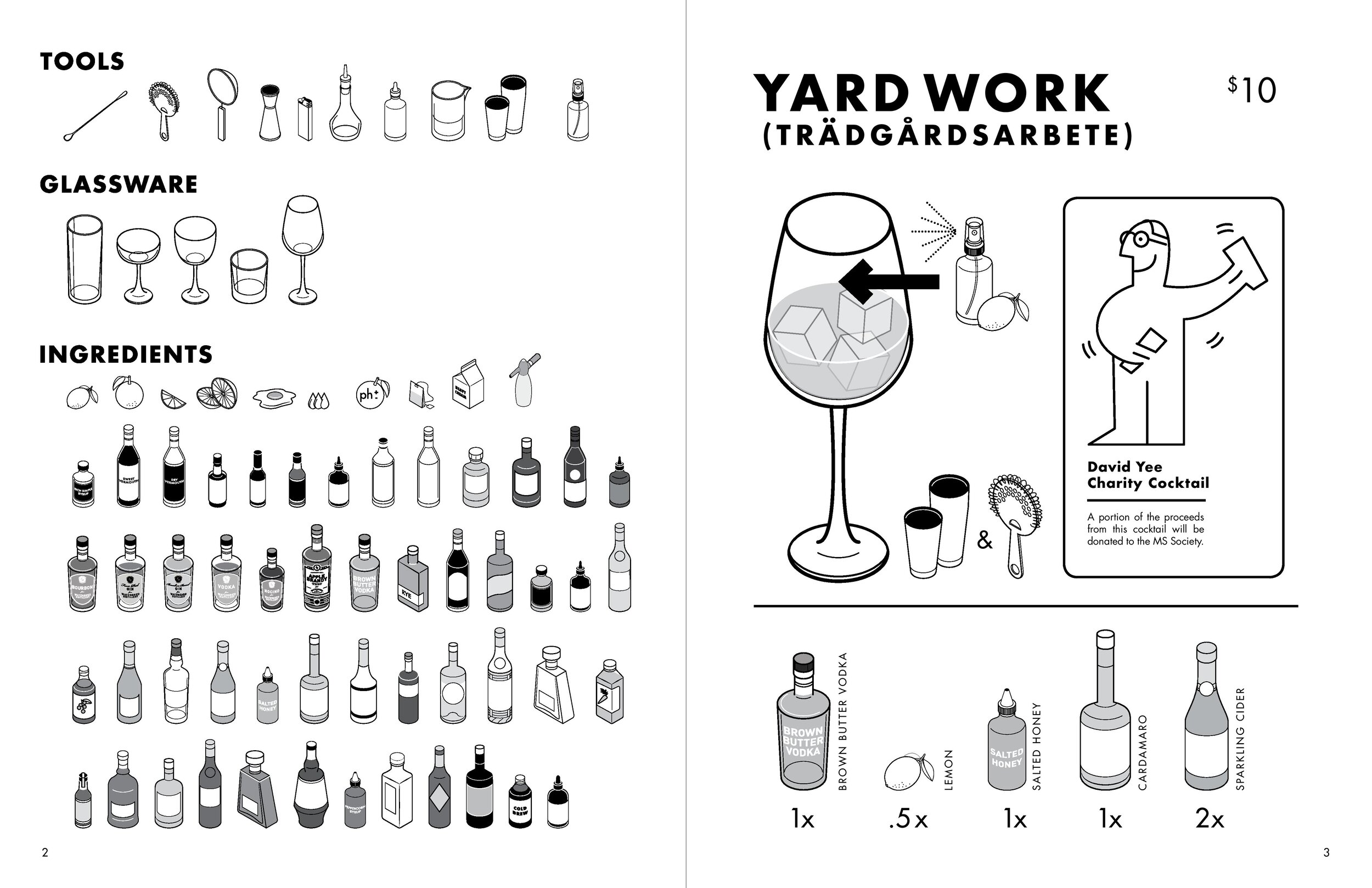
Greg also drew each individual ingredient, bottle, garnish, and tool that was needed to execute the cocktails. Later, that was turned into large posters for some of our super fans. Showing everything that was needed to craft each cocktail was not only a way of paying homage to the original IKEA instructions, but also our way of showing our guests what goes into the creation of their drinks. More often than not. your bartender isn’t simply grabbing for a few bottles and making drinks off the back bar. They are spending many hours a week infusing, creating, and mastering flavors and techniques that go into the finished product in your glass. Just how the pieces of your favored furniture are already built and you act as the assembler and not a carpenter; we concoct, and you consume.
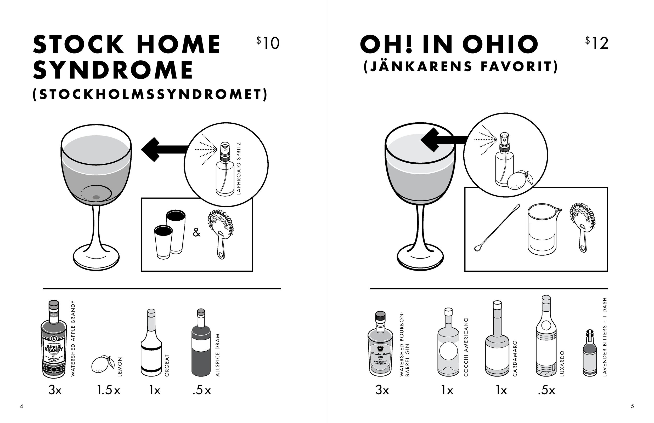
It was important for us, when creating each drink, to think about how each of these cocktails was going to look visually appealing if not draped or adorned with garnish, and how they were going to be enticing to all senses if not spritzed with citrus peels? From these questions we developed different tinctures, sprays, and dusts to accompany our cocktails, and we paid close attention to the makeup of each drink so that the final color and glow would be appetizing. Drinks like the Stock Home Syndrome (STOCKHOLMSSYNDROMET) was placed on a pedestal in a Nick and Nora glass and shined with a straw-like golden hue, finished with subtle bubbles on top from orgeat and fresh lemon juice. Where one might finish with a lime wheel or expressed peel, we finished this drink with a simple spritz of allspice liqueur so that, on the nose, a familiar fall-like scent would ready the senses.
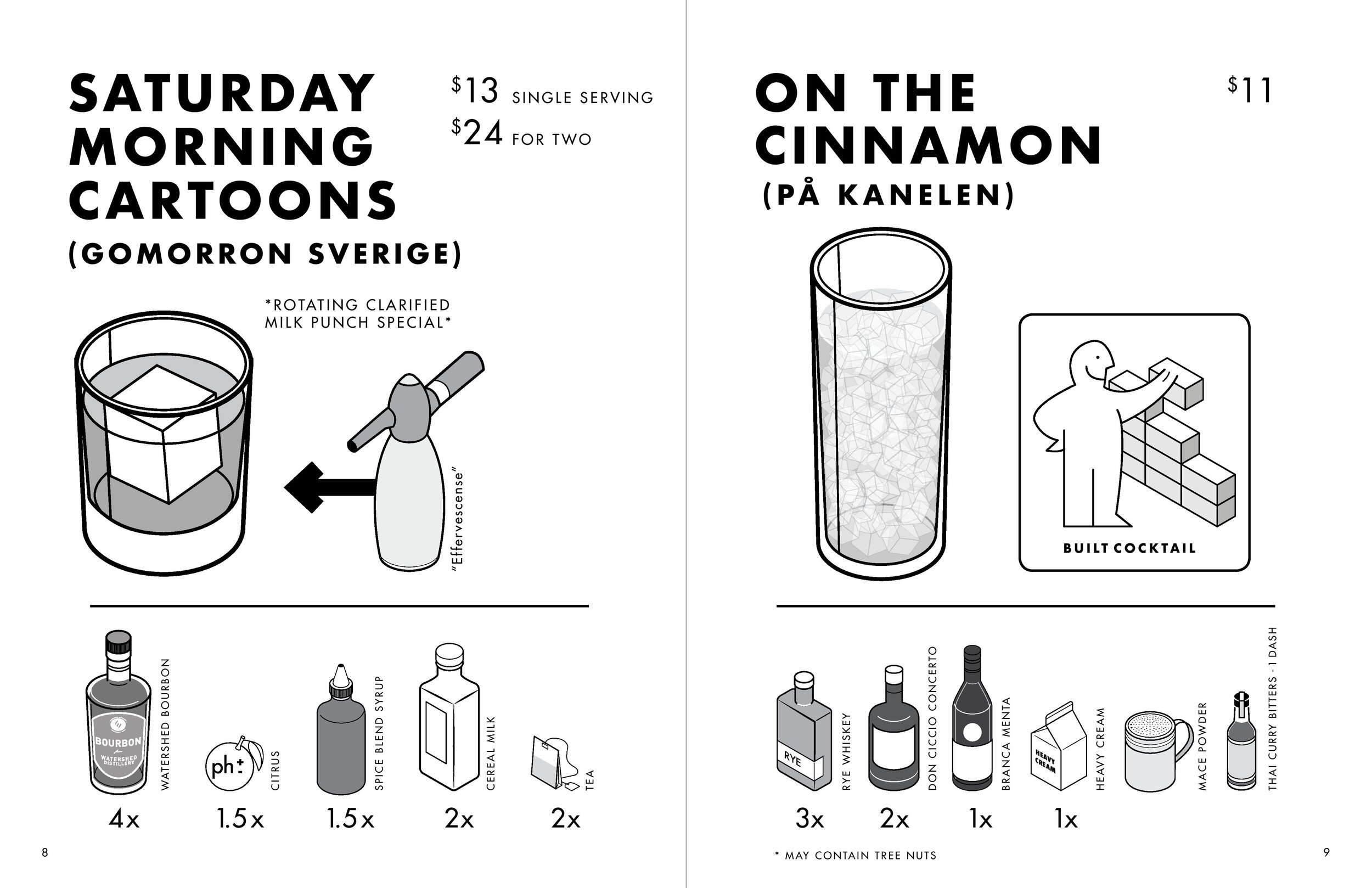
On The Cinnamon (PÅ KANELEN) was an amaro-forward post-dinner sipper served as a lovely ombre of dark brown to creamy white, and finished with a powdered spice mixture and a straw. Served over crushed ice, this cocktail drew inspiration from the espresso martini and the beloved white russian, and tasted of a lovely melange of the two without sharing any of their ingredients other than cream. Created by Luke Pierce who now owns Law Bird Bar with his wife Annie, this cocktail was an easy sell to those who loved good tasting drinks, or preferred to sip their dessert in favor of eating it.
On The Cinnamon
One of the more complex and thought-provoking mixtures came to us from David Yee who began playing with dark ports in place of his heralded sherry. Spare Room (EXTRA RUM) was composed of different rums and port, making for an elegant cocktail ripe with a chameleon-esque color variation that ranged from black to purple depending on how you looked at it. Not to be outdone by himself, David also featured the Yard Work (TRÄDGÅRDSARBETE)on this menu, which quickly became one of the crowd favorites as a crisp refreshing cooler able to lift the recipient from the chill of autumn and introduce an entire city to brown butter vodka. After consuming this drink, we had many guests asking how they could buy “brown butter flavored vodka,” then watched their eyes glaze over when we told them the technique needed to create it.
Yard Work
The IKEA menu was also our first menu to feature Watershed Apple Brandy, as the spirit launched at Watershed just a couple months before this menu was to be released. Guests who were unfamiliar with brandy as a category were able to try it in cocktails and have a conversation with their bar people to clear up any questions they may have. It’s always exciting when there are new or differing spirits making their way out of our distillery because the bar team quickly pounces on them to see what they can create, and Ohio’s original spirit was a prime example.
One cocktail, however, drew some national attention and even landed the recipe in print by way of bourbon expert’s Aaron Goldfarb’s Hacking Whiskey, a book that will teach you how to make clarified cereal milk punch to mystify your eyes and tastebuds. Saturday Morning Cartoons (GOMORRON SVERIGE), created by Alex and I, was a rotating milk punch that featured beloved childhood cereals. Cap’n Crunch and Cinnamon Toast Crunch will forever be the favorite, with Fruity Pebbles not far behind. This cocktail was also our first foray into large format cocktails, as you could order the drink as an individual cocktail, or in a serving size for two. The latter would be served with two Old Fashioned glasses, clear ice cubes (so you could marvel at the clarity), and a glass milk jug filled with cocktail and some effervescence.
Saturday Morning Cartoons
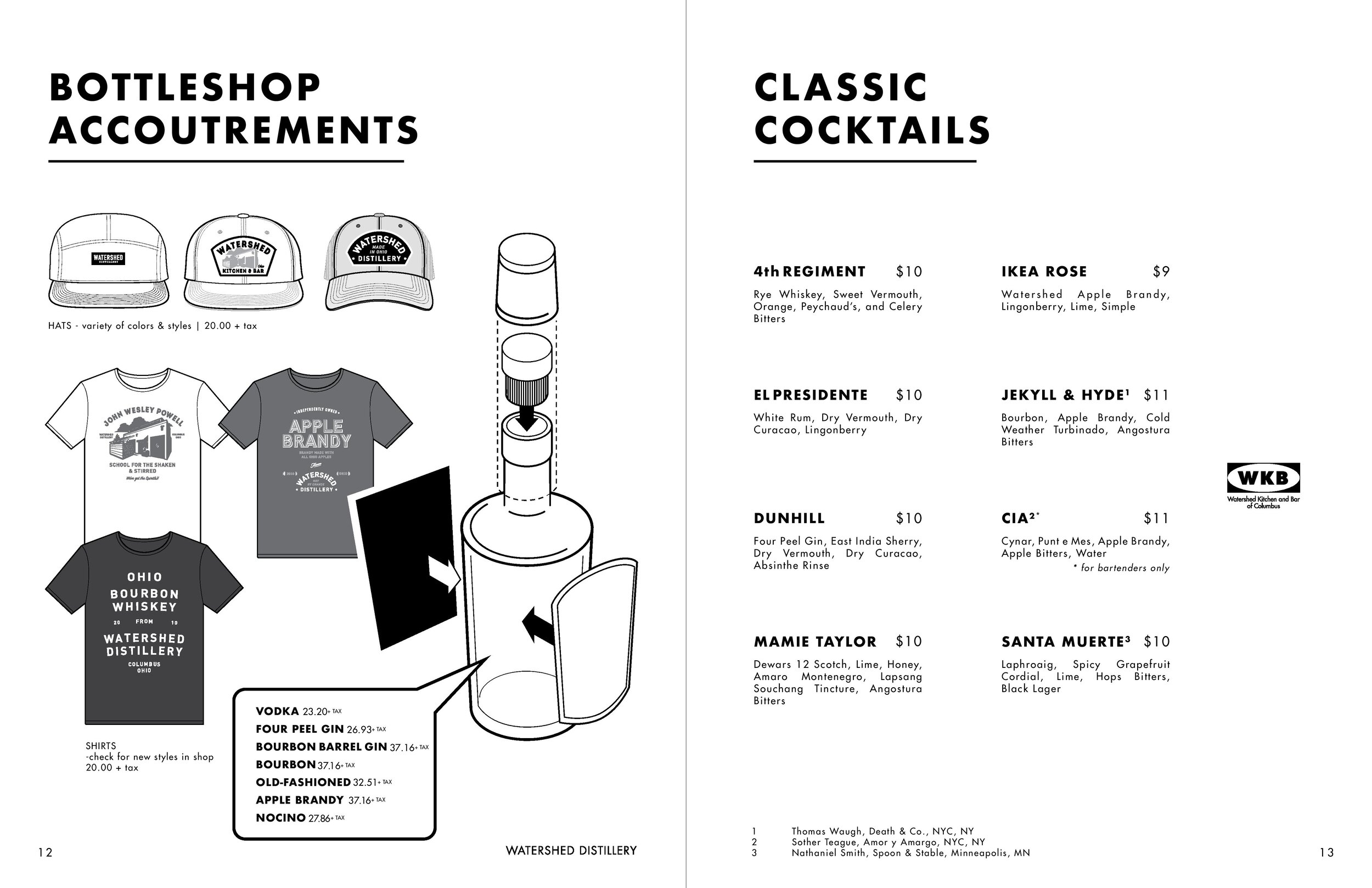
The IKEA menu also featured a wonderful mix of classic and modern classic cocktails such as the Dunhill, El Presidente, and the 4th Regiment, but none were as instantly loved as the IKEA Rose, simple play on the Jack Rose cocktail featuring Watershed Apple Brandy, fresh lime juice, and, in place of the grenadine, IKEA’s own Lingonberry syrup. In lieu of messing with the original and claiming to know better than the IKEAans do, we sourced the syrup from our local IKEA and folded into cocktail history. Since all the other cocktail recipes are shared in the menu, I’ve included the recipe for the IKEA Rose in this blog.
IKEA Rose
IKEA ROSE
1.5oz Watershed Apple Brandy
.75oz Fresh Lime Juice
.5oz Lingonberry Syrup
.25oz Simple Syrup
Shake all ingredients until well chilled, and strain into a Nick and Nora glass. No garnish necessary, to achieve clean line design.
You may have noticed that each cocktail name also features a Swedish translation. This was intentional, and went beyond us googling or creating gobbledygook for the sake of a menu. We worked with a swedish translator to create the closest approximation of what we were going for so that it would make sense here in Ohio or, if you were in Kungens Kurva in Skärholmen, south of Stockholm.
We incorporated a form of guerilla marketing for this menu as a way of generating a new audience. Once we had the menus printed, we took a stack and began leaving them on coffee tables, magazine racks, or with shop owners letting them know of the new “catalogue” and to contact us if they had any questions. A surprising number of people brought their found instructions in and couldn’t wait to try to cocktails they found when they opened the pages. We also got to see this same group hold up their menu in awe as they looked up at the bar, then down at the drawing on the cover, appreciating the level of detail that went into it.
It’s the level of detail that I most appreciate at Watershed Kitchen & Bar. It's reflected in the precision of measuring the drinks, to thoroughly explaining the backstory of our projects and menus, or why something is named the way it is. It’s the fact that when you open a menu, the whole story isn’t told on the cover -- we take the time to fill out all the pages. It is a menu produced with intention, through clarity and conviction. It’s the trust of each individual contributor selecting ingredients, designing pages, or telling the story. When you put together IKEA furniture with someone, you don’t fail at putting it together, you often fail at communicating. I like to think that at Watershed Kitchen & Bar, we’ve never had any leftover pieces and none of our tables wobble.


